Marketing Case Study:
Palmetto Pops
Branding and Design Concept for a Lowcountry All-Natural Fruit Ice Pop Business
Designing a Fresh New Logo and Brand Design
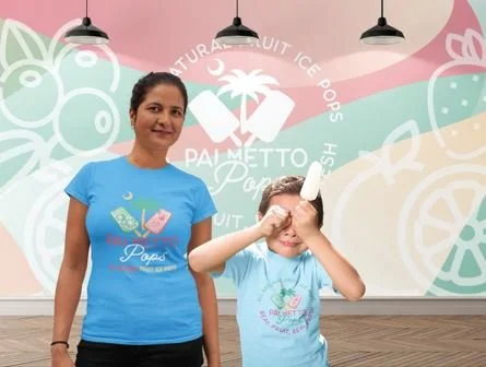
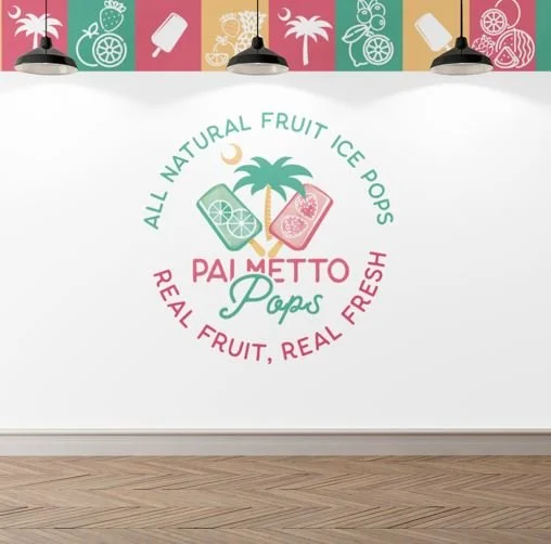
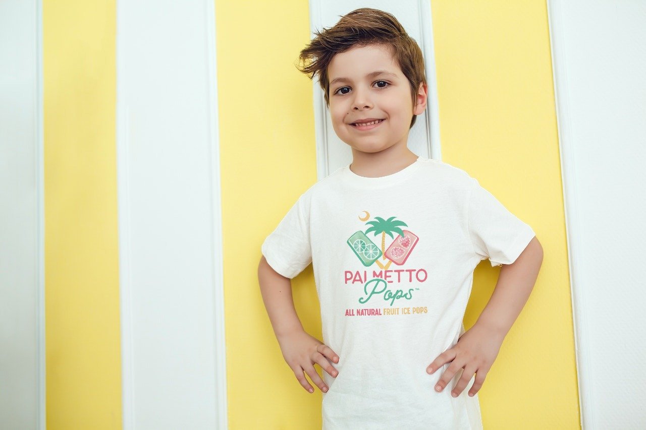
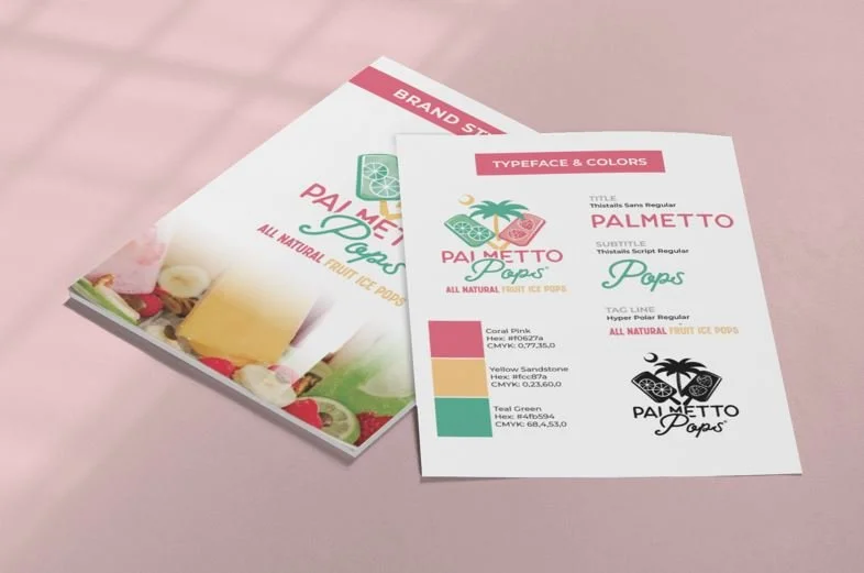
The owners of Palmetto Pops reached Tucker Marketing Group for help improving their visual brand in preparation for expanding into regional distribution and growing their South Carolina retail locations. They wanted a revised brand identity and logo that honored their commitment to crafting exceptional gourmet, fresh-fruit ice popsicles while paying homage to the owner’s Mexican heritage. It was important to retain key elements from the original logo, such as color and the presence of two ice pops with a palm tree.

A Revitalized Logo and Brand Aesthetic
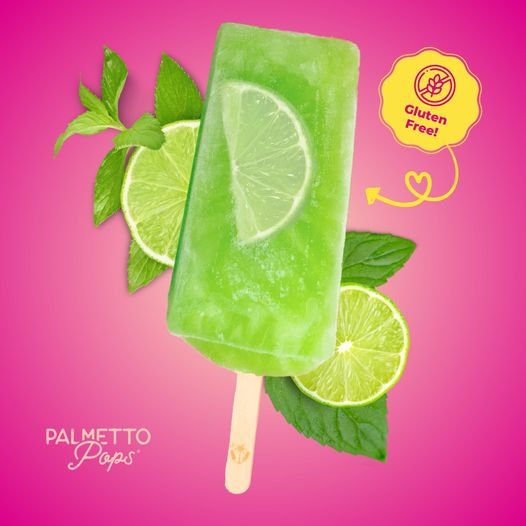
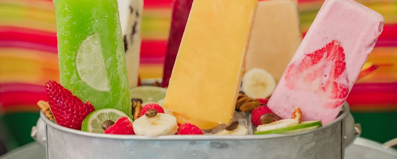
The chosen fonts align with the brand’s essence of “fresh and natural,” while the ice pops feature sliced fruit, enhancing their resemblance to the actual product. The South Carolina (Palmetto State) palm tree and moon have also been updated to match the ice pop design. The revitalized brand aesthetic preserves the cultural influence while conveying the exotic and Latin flavors inherent in the ice pops. Additionally, we created a number of concepts for interior wall designs, signage, and merchandise.